Guides
What should your website's homepage have? A complete guide
23 October 2026 · 7 min
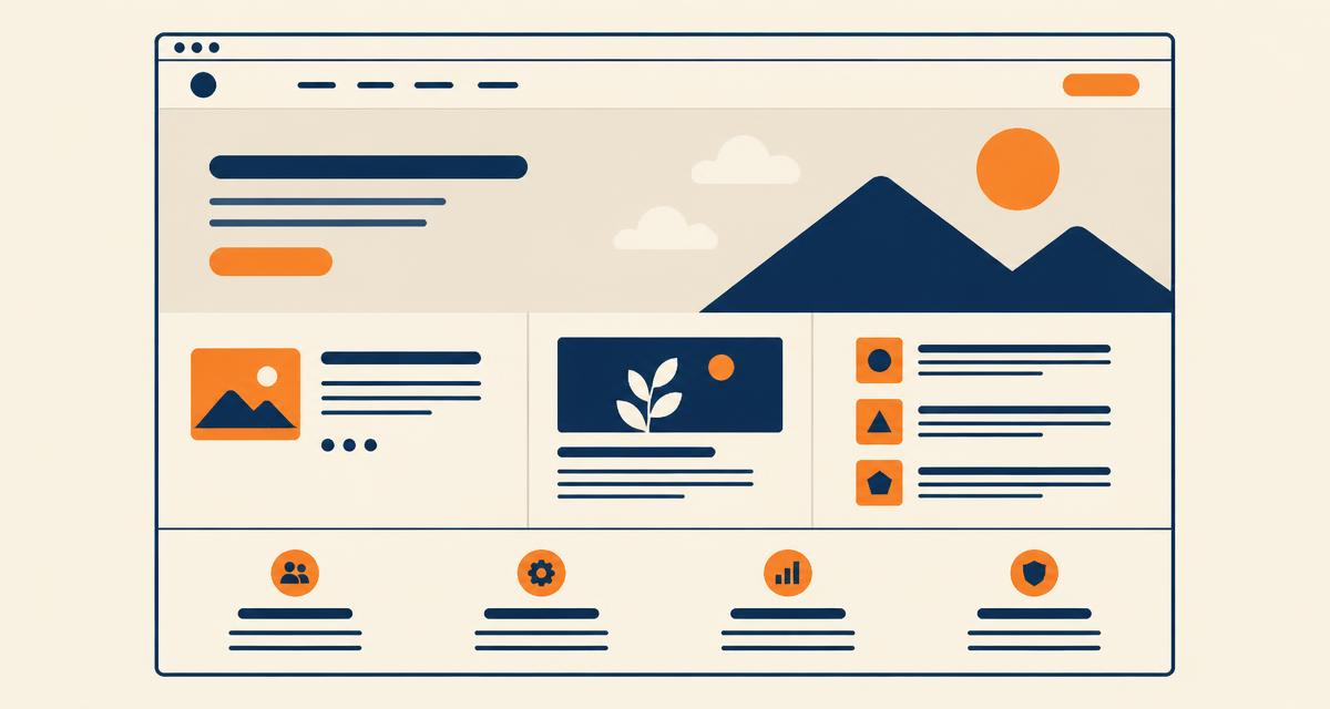
Five seconds, four questions, one next step. Section by section, what a homepage that actually produces enquiries contains.
The homepage is the most visited page and the least understood. Businesses fill it with what they want to say; visitors arrive wanting to know four things: what is this, is it for me, why you, and what do I do next. A homepage that answers those four, in that order, produces enquiries. Here's the section-by-section version.
The first screen
Cover everything below the fold and test the first screen on a stranger. It needs four elements and nothing else:
- A headline that says what you do and who for — not a slogan
- One sentence of specificity: where you work, what makes you different
- One clear call to action, stated as the visitor's next step
- One visible proof point, even a single line — "trusted by 40 North West businesses" earns its place; "delivering excellence" doesn't
"Welcome to [Company], a leading provider of…" answers none of the four questions. It's the most common and most expensive homepage mistake — first on our list of website mistakes that cost customers.
Proof, early
Within the first two screens: a case study with an outcome, photography of your actual work, or named clients. The claims between competitors cancel out; the evidence doesn't. This is why Voltworks puts its prices and service area up front — the evidence does the arguing.
Services, summarised
Three to six services, each with a two-line summary and a link to its own page. The homepage's job here is routing, not explaining — the detail belongs on a page per service, where it can rank for the searches that matter.
The homepage is a crossroads, not a warehouse. Its job is to send each visitor somewhere useful within two clicks.
A route for every kind of visitor
Three people arrive: ready to buy, researching, and not sure what they need. The first needs the enquiry route in view. The second needs work and writing to browse. The third — often the majority — needs a low-commitment next step. That's exactly why we built the free website score: it gives the undecided visitor something useful to do instead of leaving.
The footer that does work
Contact details a human can use, links to every service, locations, legal pages, and your company details as you'd want them quoted elsewhere. The footer is read more than most people assume — often by buyers checking legitimacy before enquiring.
Test it like a stranger
Run the five-second test: cover the screen, show it, ask what the business does and what to do next. Then read the six checks that tell you if a website is good — the homepage ones matter most. If the answers come back vague, the fix is copy and structure, not technology.
If you'd rather have an outside read on yours, send us the link. We'll tell you plainly what's working, what's leaking and what it would take to fix — including when the answer is 'not much'.
Talk it through
Not sure what your website needs?
Tell us what you’re trying to fix. We’ll reply within two working days with an honest view, even if the answer is that you don’t need us.